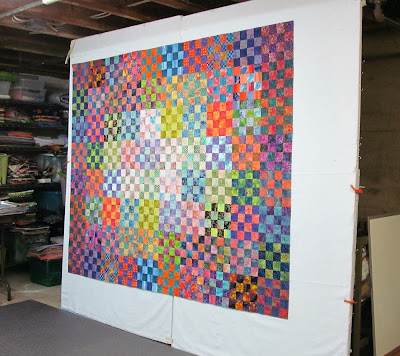
The second set of 40 (identical) blocks was put on the design wall trying to group the light blocks with the dark ones around them. I decided really quickly this wasn't working and took them down.
Then I started over with 2 identical halves, one rotated 180 degrees so they would meet in the center with all of the light together again. I thought it was a little boring and too predictable.
I moved some center blocks around until I liked it and then sewed it together. The darkest blocks give the impression of a border even though I didn't plan it that way. It is about 64" x 80".
This is the view as I approach the design wall. I worked on this one for about 12 days. I could have done it all in 2 eight hour days but it was my busy work, sewing at night after yard work in the daytime.
Here is the first yellow primrose up next to the house. The ones farther forward in the garden have been colder at night so they have a few days yet to bloom.


19 comments:
I really like the final layout... it does appear to have a border... and a nice glow in the center.
EVERYTHING here is green green green!!! I can't wait to start gardening and sewing!
I, too, like your final layout. Your placement provides movement that is very pleasing.
I also get an impression of an inner border. I love the way you work.
I like what is on your design wall!
This demonstrates the difference between quilters and quilting artists. I thought the first one looked great. I would have begun sewing. However, you moved things around bringing the arrangement to an entirely different level. Your blog is cheaper than the quilting online courses and just as informative. Thanks.
The darker self border idea really worked on this one. Much more pleasing around the center light area. You did it again!
I really, really love your final layout that you sewed together. Why? Because it is not mechanically predictable, but using a predictable pattern of squares, you achieved movement and sparkle by values. This is a masterful touch. I am glad you kept pushing through the variations until you came to this.
The final layout is wonderful! I can fully understand the process you went thru with all the changes to get to a point where you were satisfied with the final layout. It is like me and the teal/purple quilt. You just know when something isn't working and you keep plugging away until it works!
Your design wall is like a movable piece of artwork all the time. I like the layout you chose. The first was nice too.
LOVE the final layout . . . another real beauty.
The darker ones definitely do act as a border! You are a genius!
I would have gone with the first lay out. Would never have thought to do something else. I LOVE your last lay out with light radiating from the center. Thinking like this shows you are an artist, your quilts pieces of art.
Thanks for sharing your process. This is another beautiful top.
I'm echoing Mary's comment: "Thanks for sharing your process, This is another beautiful top." I've learned so much reading your blog, especially about the use of color, and experimenting with layouts. You're a great teacher!
Nice layout. This block is on my bucket list.
You've given me the impetus to start a 16-patch quilt. My DIL brought me some artist-dyed batik a couple of years ago from Arrowmont. The colors are harsher than the commercial batiks I have. I've sewn a number of them paired with my regular batiks and it just might work. I will keep reviewing your blogs as I go along to see if I can make a pleasing arrangement! Your blogs truly are quilting design classes. I especially loved the iPad "ding" every night last fall after my husband died. It was as though a friend was coming to visit. Thank you.
I totally agree that the alternating light and dark didn't work. At that point, I probably would've discarded some of the very lightest blocks. It seemed like just a couple were much lighter than the average. But with the final setting, nothing stuck out. It's a perfect setting for that group of blocks and looks just right. A bit surprising, though, as you've said in the past that you don't really like borders on your quilts? Or maybe just that you don't think of the binding as a border/ending of the quilt? Of course, as I try to quote you, I really don't remember what you said, I just have a sense that it was contrary to what you've expressed now. Never mind, you're allowed to change your mind even if that's what you've done!
Another winner Wanda, I really like the final result. I have a feeling this one wasn't as easy to set up as some of the others. Your yellow flowers was lovely.
I really, really, really like how you've put this one together. I could sit and look at it for a long time. Thank you for sharing your process. It helps.
Post a Comment