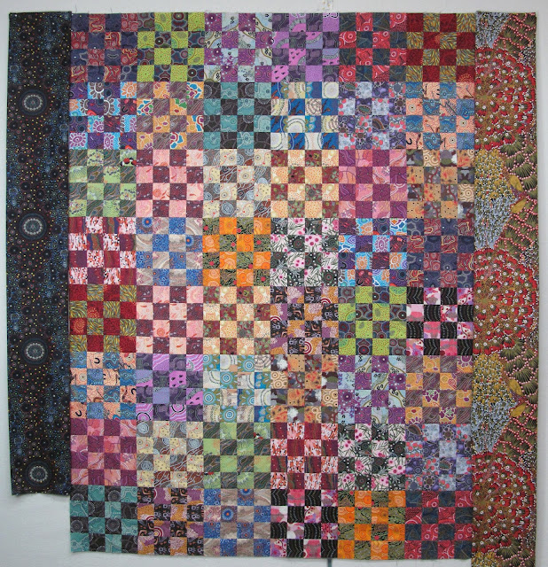
My Canon camera likes to make blue predominant, my Android phone likes to show warmer tones as predominant. (See IG photo @exuberantcolor if you have an IG account). The quilt top is somewhere between the 2 and very pretty if I say so myself. It is 48" x 64" now and I intended to add a border to this one. (sorry the bottom of the quilt is cut off by the bar on my longarm machine).
I ordered 2 fabrics from an ebay seller (at a really good price) that I thought might work for borders on Wednesday and I received them yesterday. I hung them both next to the top (close ups are following) to see what I thought. The one on the left makes the top yell "I've Been Framed!" and the one on the right blends in and is hardly noticeable as a border.
I knew a black background print would give me good contrast, but it is a REALLY BIG contrast.
One of the suggestions by many of the top quilt artists is that the border should be an integral part of the overall design of the quilt, not just something plopped on the edge to make the quilt larger. I have to decide which way to go but that won't be today. It needs a time out for a couple days. I intend the border to be wide so that is why I show it as wide borders.
Last night I switched to the other Australian fabric quilt that is mostly cut. I need to cut some more of the large squares and the fabric is all pressed, ready and waiting for me.


I love the one on the right as it blends beautifully...the left one does stand out--but that is another good choice for the final "look" also.
ReplyDeleteI like the large squares on your "Hole in the Barn Door" (?) blocks--really shows off the lovely fabrics beautifully.
A big storm is headed our way Mon-Tue; but here on the coastline it may turn to rain early on...we shall see...as I don't need to go out i would love to see some snow--37.5 here this morning and sunny--"Calm before the storm" i guess
Hugs, Julierose
for some reason I like the one on the right better - it just looks good
ReplyDeleteMaybe an inner border and then the wide border would work. Patty
ReplyDeleteI absolutely LOVE the border on the right!
ReplyDeleteI'll be the Lone Ranger and say I like the fabric on the left as it is happily busy and picks up the darker tones in the various fabrics in the center.
ReplyDeleteI like the suggestion Bruce made of a narrow 1st border, probably a tone-on-tone.
Have fun deciding! No hurry, no quilt police.
Hugs!
Sixteen patch is so full of fun fabrics . . . . . and now to choose the perfect border. I agree with you on the dark border “I’ve been framed”. The border on the right, is a perfect print, those scalloped half circles breaks up and adds a fun rhythm running around the 16 patch blocks. But what do I know. (*._.*)
ReplyDeleteYour other Australian one in waiting is looking so good too .
Waking up to the time change set me back an hour and it will bother me all day. Getting too old for these time changes… i do think it would be smarter to stay on standard time year round instead of day light savings time especially for us ‘up north’.
JJM
You're gonna hate me, but I'd suggest a small border of the black to round things up and then a wider border of the other print. You are killing me with the churn dash blocks with the aboriginal prints! I can see another project coming. I just finished the binding on an aboriginal print quilt on Friday.
ReplyDeleteI know you have probably already decided but I'll toss in my vote for the one on the right. I love it.
ReplyDeleteI love the fabric on the right. But in the quilt i see the orangey yellow. I would suggest that as an inner border.
ReplyDeleteThe 16 patch is beautiful and I would have a hard time chosing between the 2 borders you've shown. I think I can guess which one you'll pick, but I could be wrong! And I LOVE the Churn Dash in the Aboriginal fabrics. So fun!!
ReplyDeleteOK - I'll be the odd man out - I think the fabric on the right would make a good border for the quilt with the Australian prints - ;))
ReplyDeleteI’m enjoying watching your progress with the Australian fabric quilts, lovely!
ReplyDeleteBeautiful finish of the blocks. Borders are tricky. Maybe a skinny border before the wide to not be such a huge jump. I love borders as they can really make the blocks shine like a low border of flowers in front of rose bushes.
ReplyDeleteHi Wanda, I like the one on the right too, mainly because it does not draw attention to itself but makes the quilt the star of the show. Just finished a quilt with no borders because everything I tried robbed the top of its stardom. I'm sure your choice will be exuberant!
ReplyDeleteThe border on the right does it for me, love it. The one on the right I feel is too dark and overpowers the body of the quilt.
ReplyDelete