I got busy early and decided on a layout for this project. For anybody new wondering what is a Sunday only project, it is one I pull out to work on only on Sundays. It went back in a box each Monday morning to be brought out again the next Sunday. In this photo I have sewn all of the horizontal rows. There were 3 blocks with 8 triangle strips and one block with 4 strips in each horizontal row. Since it is only 2" off of square I need to add something to make it more rectangular.
This is one idea I am considering. I just grabbed some strips that were on a shelf and put them in for a visual. This project is mostly Kaffe Fassett Collective fabrics and the rest is batik and yarn dyed woven plaids.
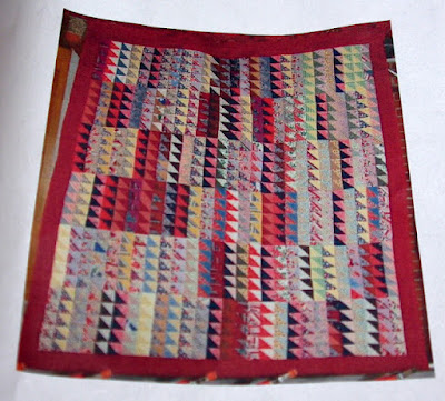
I decided to add the photo of the antique inspiration quilt. I think I will add a border all around mine too to contain the chaos.
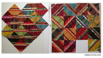
I came up with a couple more layouts for the other project so I made collages. Click on photos to enlarge them. This is layout 1 and layout 2.
Here are layouts 3, 4, and 5. This is just a small portion of the blocks that will be in the quilt. Layout 1 is out of the running, the other 4 would all make nice quilts. Layout 4 could have ths zigzags running horizontal or vertical. Layout 5 would have a mirror image of zig zags at the bottom with the squares across the center of the quilt. I think there is one more layout that I might like but my design wall isn't free right now so I couldn't try it.


Okay--now you're just getting TOO creative with all those different layouts! They are all good and don't help your indecision one little bit. Do you need to do them ALL now? Actually, all of them are better than the original Tapas design, IMO and you can't go wrong no matter what decision you make!
ReplyDeleteI like your strips solution--nice resting place for the eyes; and
ReplyDeleteI am still fondest of strata number 3.
Really cold this morning--24 degrees--and the plumber is here to hook up the
outside line for the propane generator...brrr....better him than me!!
Hugs, Julierose
I would think the design you pick would be dependent on how many blocks wide and long you are planning on. Design 3 looks like a four by four block design. I don't think you can go wrong with any of the designs.
ReplyDeleteI still like #3
ReplyDeleteStill like #2 best.
ReplyDeleteInsets added to your ‘Sunday Only’ has not only made a nice rectangle, they added to the finishing touch to this “Exuberant” piece. Anxious to see if you use the insets shown .
ReplyDeleteTapas is one fun block to create with… I’ll just wait till you decided which layout wins.
JJM
I like the added strips to Sunday Only. It does calm it a bit. I love all of the layouts for new quilt. You could make them all! :D
ReplyDeleteMy fav layout is still #3.
ReplyDeleteI really like the strips added to Sunday Only.
Loving the addition of horizontal strips into the Sunday Only project . . . will be fun to see what kind of border options you share. And of the lower layouts for the strip sets, I am really quite liking number five with the center row of squares on point.
ReplyDeleteIt’s so fun to see all of the various layouts. That Sunday project is really nice too.
ReplyDeleteIn the Sunday only top, I think the pale blocks do a good job of calming things down and giving your eye a place to rest. The addition of the strips makes my eye focus right on those. On the string blocks, yep, I still vote for layout 3.
ReplyDeleteLove the idea of a Sunday project! That's when I tend to do more applique work though so maybe I already sort of do that.:)
ReplyDelete