After looking through my pile of Kaffe yarn dyed woven stripes I decided that 2 of my favorites were the ones to add. I saw this stripe in the Rowan book from 2000 which shows Kaffe's earliest fabrics. I knew they were the older fabrics because they are woven with a rougher thread. The bottom one is more red-purple than it looks here. I then chose the 3 strips that would go with each of the stripes.
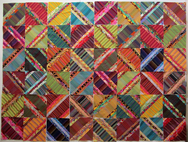
Once the blocks were sewn it was design wall time. In this first layout 4 blocks make an O shape. There are 12 large blocks made of 4 blocks for this design.
Then I moved the vertical row on the right to the left side to make all X blocks and I like this much better. There are 2 blocks alike now at the lower left with the row from the right moved over there so I need to move one.
And then I came up with another idea. Since every block has all bias edges and these fabrics are very soft maybe I should sew 4 block sections and use some of the shot cotton solids for sashing and a border. The design wall is showing white between blocks but the shot cottons would be intense colors like the rest of these fabrics. The straight of grain strips would help control the stretch of the bias in 20" lengths instead of 60" and 80" seams.


I like the sashing idea. It helps me see each set of four blocks, like individual paintings.
ReplyDeleteThe top layout is my favorite. I don't like the sashing idea. To me it breaks up the continuity but that's just my opinion.
ReplyDeleteI agree with Barb. If you want the X to stand out, separate it. If you want a wild and wonderful look, don’t use sashing.
ReplyDeleteI understand your point about the sashing controlling the stretch issue, but I love the look of the blocks all together sans sashing.
ReplyDeleteI think I like layout one best, but understand the desire to solve some of the bias problems.
ReplyDeleteI am curious to see what it will look like with the shot cotton sashings.
ReplyDeleteSuch a pretty layout--[ah yes all those bias edges remind me of my (failed) spider piece--it's still "waving" good-bye with its borders!!]
ReplyDeleteI am sure yours will go together beautifully...
Heavy rain here today and 56 degrees--I guess the temps are waiting for "official Winter solstice" to drop. Hugs, Julierose
I bet in person those colors are really alive and saturated. Lots of choices!
ReplyDeleteLove, love your thoughts on the sashing inserts, this piece comes alive for me with break between each set of 4 blocks, and actually highlights the pattern and fabrics in each block.
ReplyDeleteJJM
The sashing kind of calms the look down. Helping to control the bias edges is a plus!
ReplyDeleteHaha! Spoken like a true quilter. I'm waiting for your next post that Shows even another layout! So much great creativity, so many choices! It will be beautiful whatever layout you choose.
ReplyDelete-- LindaH