

I thought the dark brown yesterday looked depressing and darkened the quilt too much, just not the look I'm after. I liked the beige with gray and lavender circles the best and realized that most of my choices were too plain and it really needed to be a busier print to not just jump and be the first thing you saw. I want to thank you all for your comments and the reasons for your choices. It helps me to see things that I am missing by being too close to the project.
 I'm adding the photo in the book to this post so you can see that the corner squares need to be integrated into the design, not jump out at you. Kaffe used little pinwheels and not the same fabrics in all of them either. I want my corner squares to blend in more with the sashing strips too. So now the question is, do any of the last 3 fit the bill? 2 of them are close, but I'm still not positive. I have 10 more sashing strips to make and I need to have the corner squares chosen by the time they are done. You know, the next quilt is calling me............
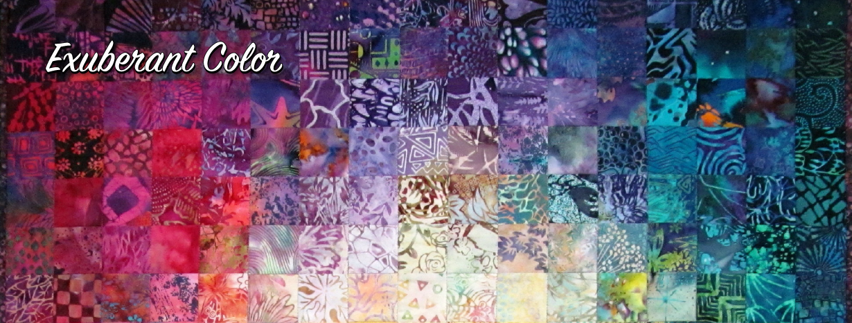
16 comments:
I am intrigued by your statement, "I'm adding the photo in the book to this post so you can see that the corner squares need to be integrated into the design, not jump out at you," particularly the word, need.
If you want to make a quilt that hews that closely to the one in the book, then, yes, the corner squares need to be integrated into the design and not jump out. But if, in making a quilt, you discover some aspect that of it (e.g. the corner squares) that you like when done in a different way from that done in the book, then I think it's not only legitimate but desirable to switch from, "I'm making this quilt in the book," to, "I'm making a quilt based on this quilt in the book."
Bottom line: I think you should make a quilt that you like. If the next quilt is calling you, that's a sign that you've reached the point of diminishing returns in analyzing decisions about this one. Pick a fabric that you like for the corner squares and sew it, girl!
In this post, I have to say that I like both the red and the brown. I am not sure what it is, the fact that maybe they "pop" a little more than the other choices even though that is not the first thing that you see. I guess to me they just seam to fit with the quilt. But in the end, you need to go with your gut instinct and make it your quilt!
First off, your quilt is more colorful than the book...yes, exuberant! (Had to say that!) I think the two fabrics in the first photo are good if you don't want them to 'pop' out. I really like the pink/red fabric in the second photo. Thanks for taking us on this quilt making process with you, Wanda! This quilt is lovely.
I can see what you mean by the squares being integrated into the design. I would never think to go through all that! I like the first sample at the top. I think the color is integrated and it really brightens the look of the quilt.
If YOU want the squares integrated, the bottom red does it best. However, I really, really like the dark ones of yesterday they fall back, making the quilt look dimensional.
You'll have a fabulous second quilt with all of those auditioned squares!!! I like the darker toned brown with flowers. It looks so rich.
I like the first new one with the circles on beige. I thought most of your picks looked good.Wig.
Knowing your desires, to me the pink one stands out too much. I think either of the top ones could work, just a slightly different feel, without either popping.
I really like the brown print.
One more opinion.....I like the lighter beige with the lavender and etc. The lighter background in the cornerstone blends with the sashing. You are right about blending needing the busier print. Bottom line.....pick the one you like the best.
Of the three today, I like the first one the best as it adds some playfullness when viewed with the sashings, though I still like the green dots from yesterday too. I do like my green. :)
I really like the green as well. It adds dimension and really shows those wonderful blocks of yours off. It also has a grounding and calming effect, which makes the quilt not so busy. And this is coming from someone who enjoys busy quilts. Balance.
The quilt has a lot of light colored fabrics in the shashing. To me the light colored corner squares do not create enough contrast to give the eyes a place to "rest". I hope you understand my meaning. For that reason I like the brown fabric with the flowers best. I am familar with this fabric and the flowers on it brighten the overall tone so it does not appear to dark.
The top circles on beige but more gold looks even better than the paler one I liked yesterday. The squares blend well with the sashing and don't compete with your lovely blocks. Lighter feeling altogether than Kaffe's...I prefer it!
I can tell you my preference is for the brown floral print, but explaining why is another matter. I think it blends, or pulls together, the colorful blocks and sashing. The lighter beige fabric accentuates the sashing, and while it indeed creates the illusion of a floating grid, that's not the look I'd be going for. If you were making this quilt for me, Wanda, I'd prefer the integrated look. Besides, I'm nuts for that brown floral print! But if you are keeping this quilt, you should be true to yourself.
Out of all the examples you have shown I like the brown with the flowers the best. It will be interesting to see what you choose.
Post a Comment